


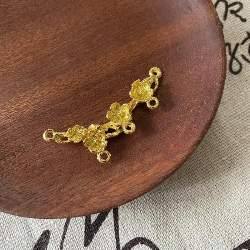


Warm metallic-looking details without material overclaiming
Build a Gold Bead Mix around Finish and Proportion
Gold-colored components can frame a focal piece, divide a strand or carry the entire palette. Compare bright, antique, matte and rhinestone-like effects while checking the stated base material, coating, size and opening on each product page.
Recommended product directions
Four Gold-Colored Roles in a Finished Layout
Metallic Acrylic
Use a lighter component when a full strand needs shine without excessive weight.
Browse current results ReflectiveGold Glass
Compare coating, transparency and edge detail on the live listing.
Browse current results StructureSpacer Beads
Create visual breaks around larger focal pieces and busy color sections.
Browse current results PersonalLetter Details
Add initials or short text while keeping the palette warm and coordinated.
Browse current resultsPractical buying guidance
Select Gold Beads by Tone, Coating and Design Role
Gold beads should be evaluated first as a color and finish family. Bright yellow gold, pale champagne and antique bronze-like tones can look very different together, even when every product uses the word gold in the title.
The finish does not prove precious-metal content. Acrylic, glass, alloy and coated components may all create a gold-colored appearance. Only use terms such as 14k or gold filled when the individual product documentation verifies that material.
Spacers are useful when the palette includes several statement shapes. A small warm divider can separate large colors, prevent decorative sections from visually merging, and make the central focal easier to read.
For bracelets, opening size and outside diameter affect both assembly and comfort. A broad decorative piece may reduce the inside circumference, while several heavy glass parts may require stronger stringing material than a lightweight acrylic mix.
Black creates formal contrast, white produces a brighter neutral result, and clear components allow the metallic-looking accents to remain visible without adding another strong hue. Keep finish temperature consistent unless a mixed-metal look is intentional.
Rhinestone or crystal-looking effects describe appearance, not necessarily material. Check the listing for the base component, stone type or decorative surface before repeating those terms in a finished-product description.
For necklaces, use warm accents to frame the focal area rather than distributing every size evenly. Repeated small parts can produce a fine chain-like rhythm, while several large components create a more decorative statement.
Batch planning requires exact variant records. ZoeDIY can organize the shopping path, but the live page determines coating, dimensions, hole measurement, pack quantity and whether a specific tone is currently available.
Buying and compatibility help
Gold Beads FAQ
No. Color and coating do not prove precious-metal content. Use only the material stated on the individual listing and avoid terms such as 14k or gold filled unless they are explicitly verified.
Bright finishes create stronger reflection and a cleaner modern look, while antique tones feel softer and more muted. Compare the hardware and neighboring colors before selecting a batch.
Place them beside larger focal components, between changing colors or around letter sections. Their role is to create separation and support the intended rhythm.
Yes. Black creates stronger contrast, while white keeps the result lighter. Clear components can also separate warm accents without adding another dominant hue.
Choose a diameter that sits comfortably and a hole that fits the stringing material. Larger decorative parts may need fewer repeats and additional spacing.
Describe the visible effect and then follow the verified material information on the listing. Do not assume natural crystal, diamond or a precious-metal base from appearance alone.
Save the exact tone, product link, dimensions, stated material, coating or finish and units per pack. These details are more reliable than a broad gold bead label.